Before and After: Winning Remodel in Victory Heights
It can be pretty hard to see the potential in certain houses. The folks at 360Modern offered to give us a peek into the before and after of this 3 bedroom, 2.5 bath mid-century at 2129 NE 100th St. Thankfully, Wittman Estes Architecture + Landscape was capable of looking past the peeling paint, broken windows, sagging gutters, second floor deathtrap-door-to-nowhere, and overall home interior of a hoarder on this one. Few structural changes were made beyond bumping out a stairwell off the dining room to connect the lower-level, and adding a master bath on the main floor. However, all new interior finishes, roof, plumbing, electrical, windows, energy efficient gas furnace and water heater make this home like new. I think you’ll agree that the transformation is impressive.
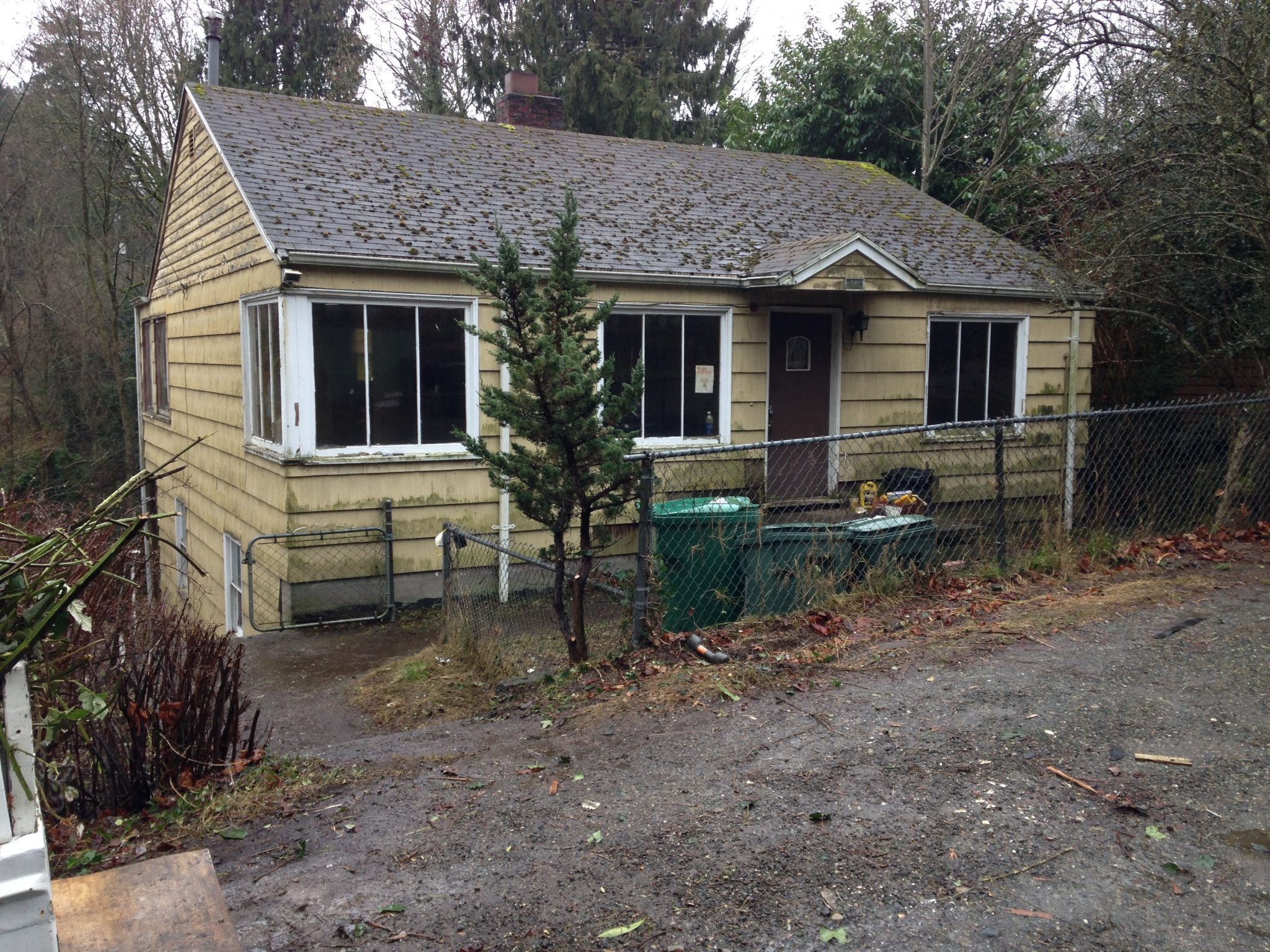
EXTERIOR BEFORE: From the outside, this house almost looked condemned. It was really crumbling and cracking at the seams, and a chain-link fence never adds to curb appeal.
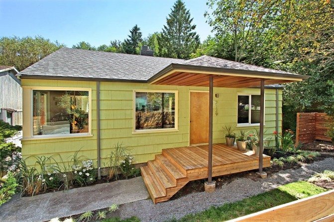
EXTERIOR AFTER: A new roof, windows, and lively paint color make a tremendous difference. I really like the covere-porch entry, which is essential in the rainy northwest. Though you can’t see it well in this photo, a wooden fence lined with new sod, plus fresh plantings around the house, replaced the old chain-link and dirt combo.
LIVING ROOM BEFORE: Oh boy, where to begin. This dark and dreary living room is so cluttered that you can’t even get a sense of the space. I do see a hint of the original hardwoods under that scary shag carpet.
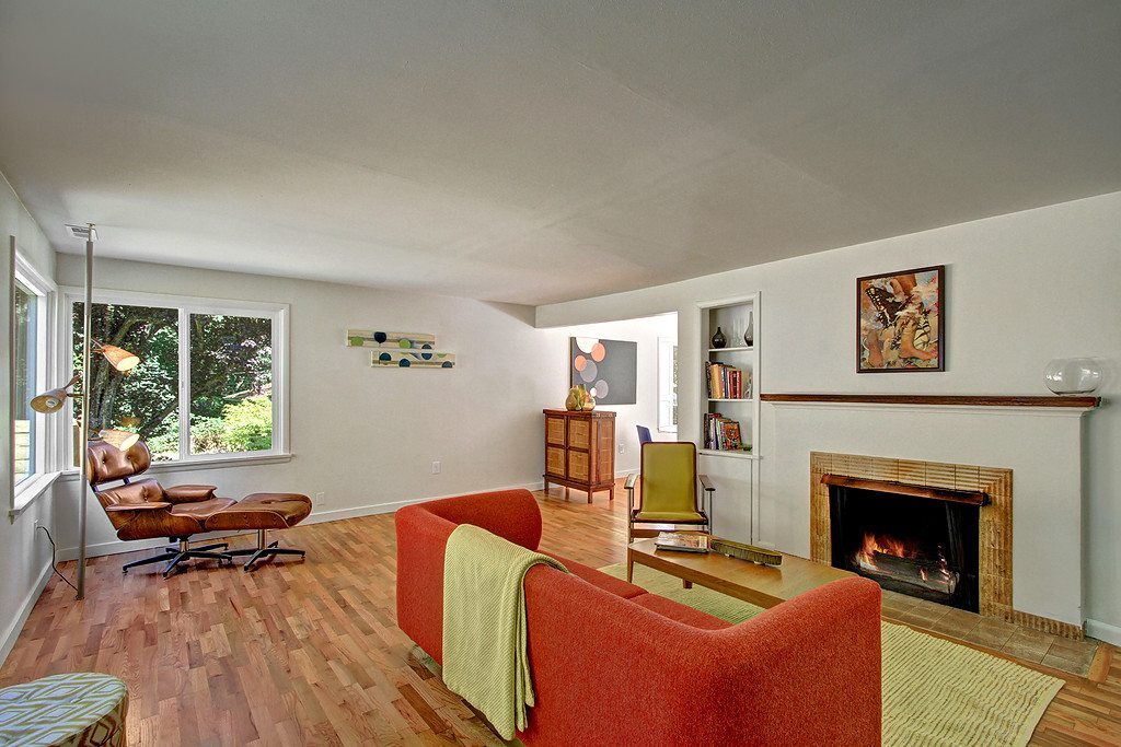
LIVING ROOM AFTER: Can this even be the same room? It’s a wider angle, of course, but light now fills the space from those same corner windows. Polished floors, white paint, and obviously a lot less “stuff” brighten up the space immeasurably and return it to its original mid-century style.
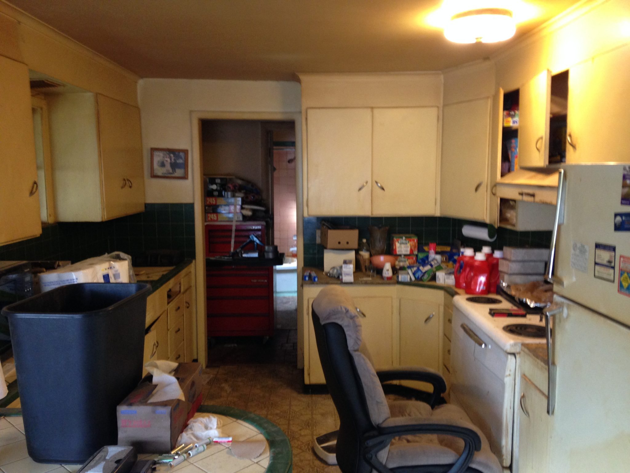
KITCHEN BEFORE: OK, as much as a cushy desk chair in front of your fridge might seem like a stellar idea after a certain recent legalization, this kitchen is dreadful. Clutter aside, it feels very closed in. I don’t think that laminate floor could be cleaned without a sandblaster. And, cabinetry doors are off their hinges or just plain missing.
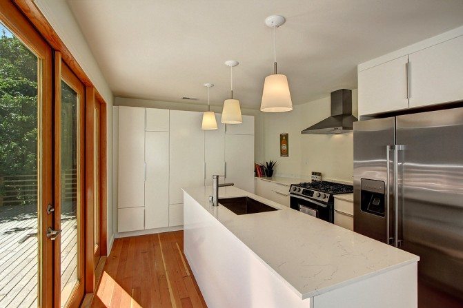
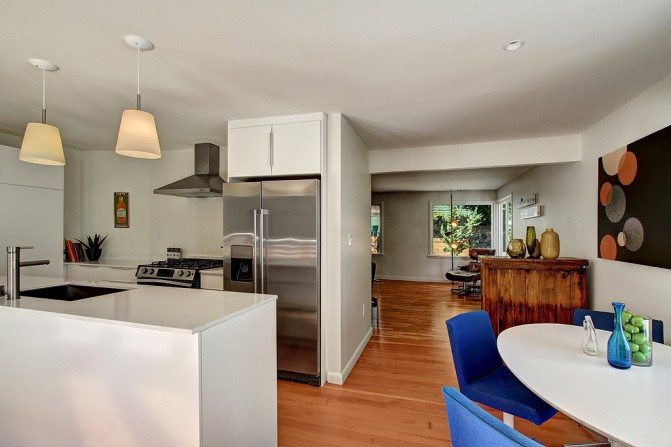
KITCHEN AFTER: Again, unrecognizable. The “lighten and brighten” theme continues in the kitchen, which has been completely restructured to create an open feel that extends into the main living space. The full-wall pantry is fantastic. We’ll get to the outdoor space in a minute, but French doors paired with full height windows accentuate the opportunity for indoor/outdoor living on this creek-front property.
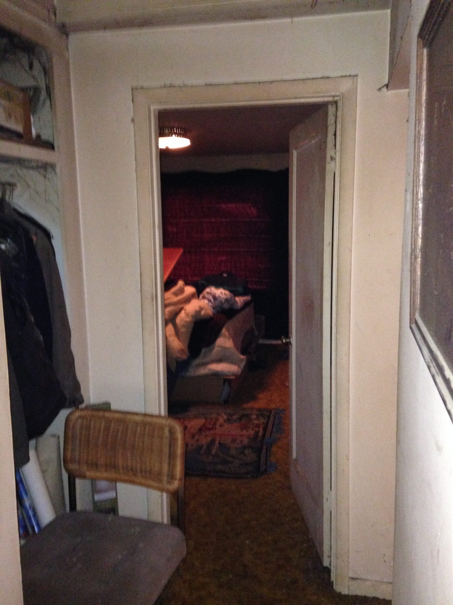
BEDROOM BEFORE: Ha! They didn’t even want to go in. I don’t blame them.
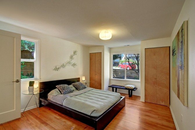
BEDROOM AFTER: So calm and refreshing. I notice that the closets are small, which is pretty typical of this time, but at least there are two. Plus, plenty of room to add dressers for additional storage.
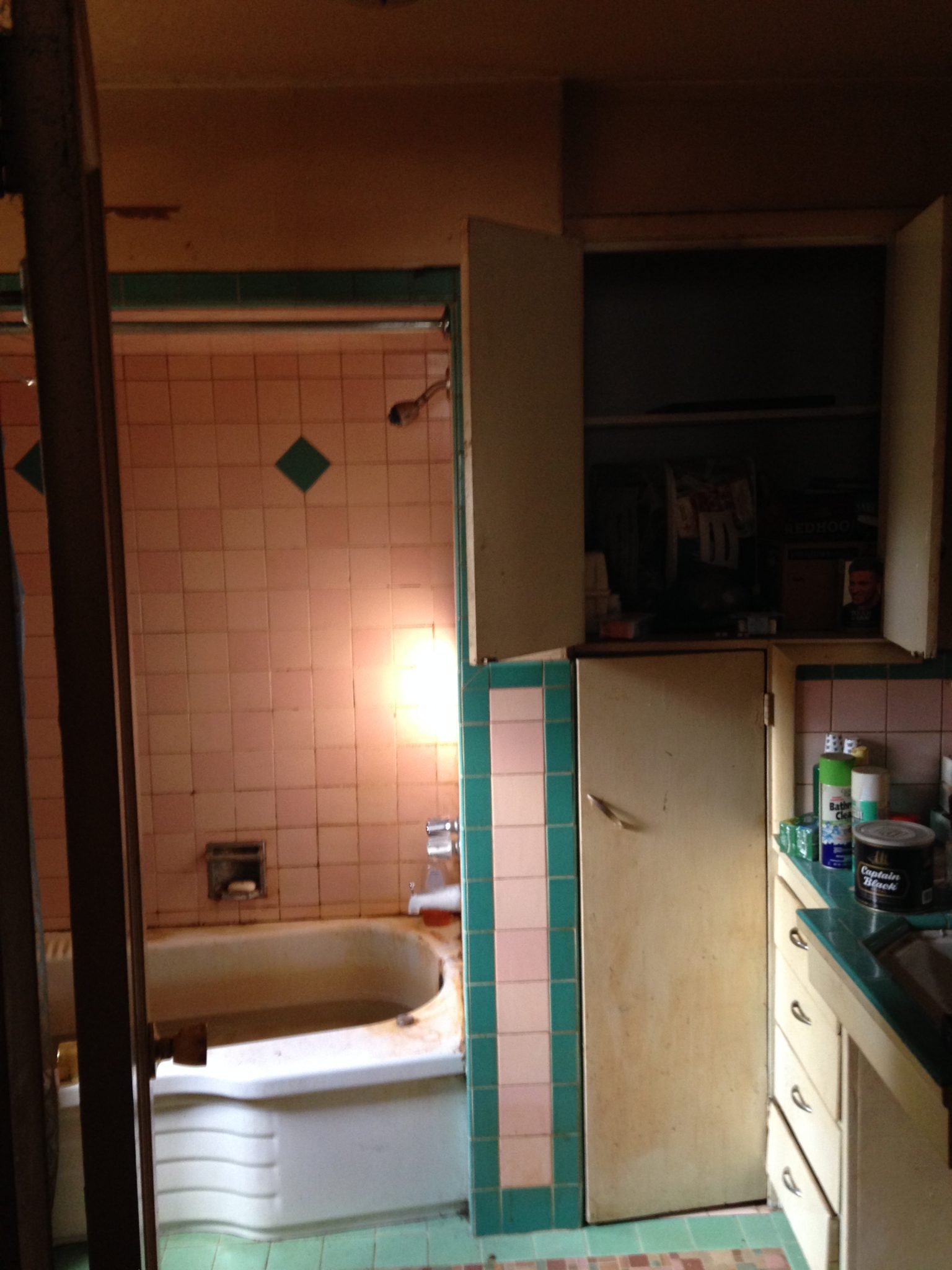
BATHROOM BEFORE: Is that standing water in the bathtub? Yikes. Built-ins are nice and the pink and green tile was completely modern in its day. Sadly, that day has come and gone.
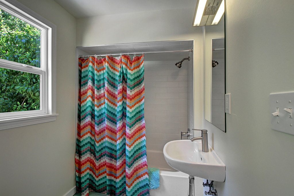
BATHROOM AFTER: Ahh. Looks like some space has been taken for other purposes, but I don’t mind. This bath is still a very reasonable size. The tiled shower is a nice touch, but the mirror/light combo seems like too much of a money saver pick. Of course, it’s a very easy thing for the next owner to upgrade based on their style without breaking the bank.
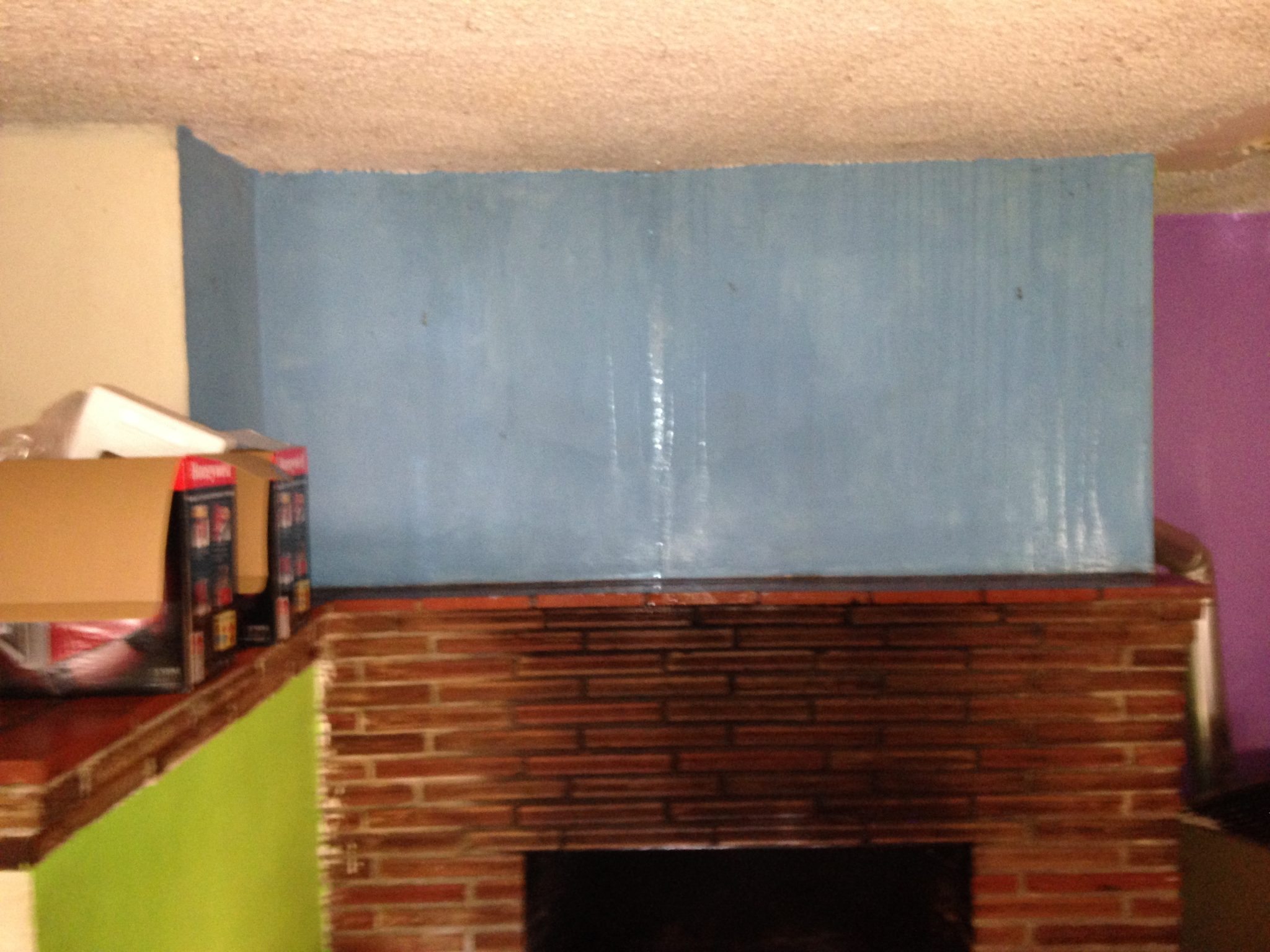
FAMILY ROOM BEFORE: If you thought the living room was a mess. This photo only hints at the multicolor catastrophe that was the lower-level family room.
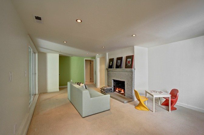
FAMILY ROOM AFTER: This is a nice large family room. Perfect for a theater room for the adults or a play room for the kids. Or both. I actually appreciate the nod to the former acid green wall with an updated color choice. It’s fresh.
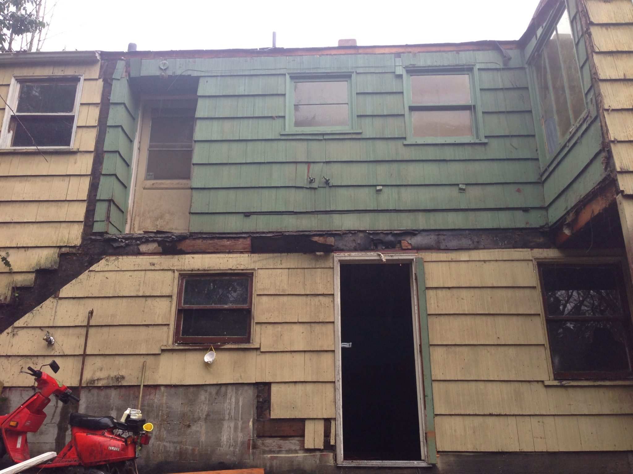
DECK BEFORE: What deck, you ask? Well, I can sort of make out where it once was. Only the deathtrap-door-to-nowhere remains.
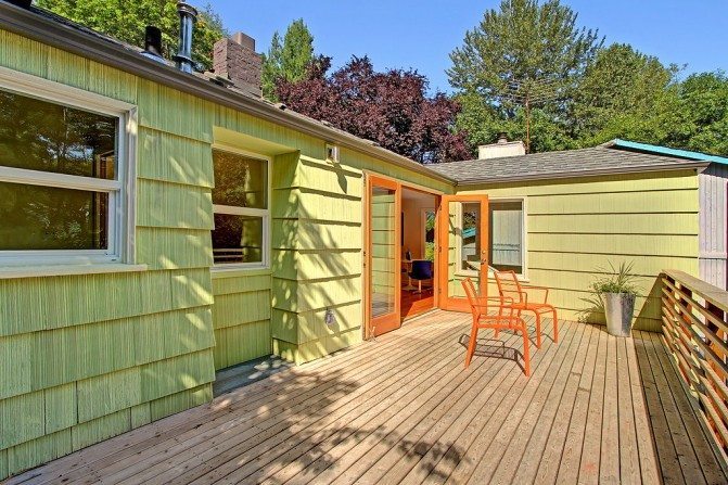
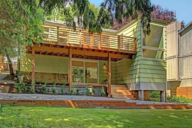
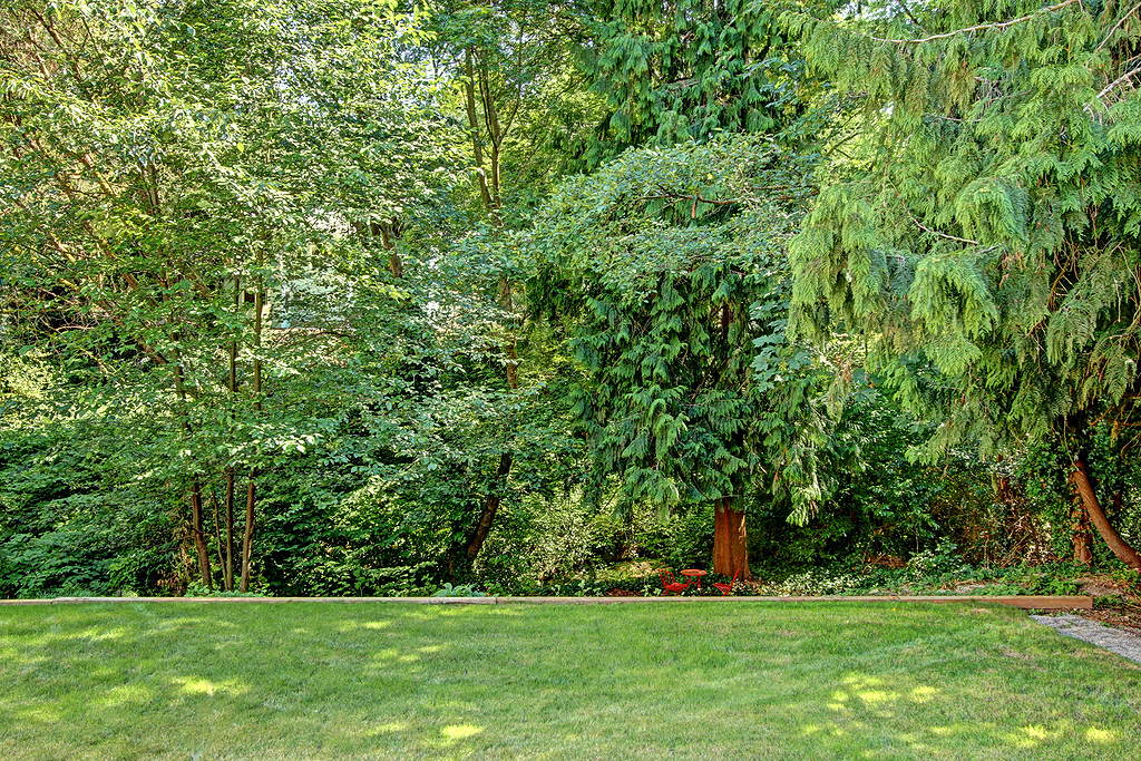
DECK AFTER: Remember those French doors in the kitchen? This is where they lead! Plenty of room for grilling and outdoor entertaining. My only question is why there aren’t stairs to the backyard. The lot is over 8,000 square feet and backs up to 35 feet of Thornton Creek. It would be great to not have to go downstairs or around from the front to access it. Again, not a terribly difficult thing to add, but it would have been well worth including during the remodel.
